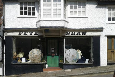
As I once worked as a graphic designer, I keep a look out for old shop signs with interesting lettering. They're often preserved because the shop is doing badly or the owner is old. Thanks to them, we see layers of urban archaeology that would otherwise be covered. This dress shop in Hatfield (above) is in the old town, not the new town of the 1950s, but its name is spelled out in a classic slanted Clarendon letter almost identical to the lettering used on the Festival Hall in 1951. The Festival Hall lettering was designed by lettering historian Nicolete Gray and is illustrated in her Lettering on Buildings (1960).
This old fur shop in Vienna, which I passed in a side street a few years ago, looks as if no-one has been in it for twenty years. I liked the script lettering, picked out in neon.
This is the rather self-conscious window display of Eleskamra, an organic food store on the Wekerle Estate in Budapest. Wekerle was an early 20th century housing development build by a progressive city council, mainly for civil servants and public sector workers. The Arts and Crafts architect Károly Kós was responsible for the town square where Eleskamra is located.
Finally a shop front in London that everyone knows, F.Cooke's jellied eel shop, with its beautiful glass and gold fascia.


No comments :
Post a Comment